

Nimbus
January - May 2024
In collaboration with Annie Vardanyan and Harrison Turner
Nimbus is a hands-on UI/UX project, exploring real-world design processes to achieve key learning goals. This project focuses on understanding, user needs, creating personas and journey maps, rapid prototyping, collaborative design, and applying Lean UI>UX principles. Our final deliverable, a game administration platform, demonstrates our proficiency in addressing these goals because it has the capacity to be technically complex and visualize a large variety of media.
FOCUS
UI/UX Design, User Research, Information Architecture
SOFTWARE
Adobe Suite, FIgma, Figjam
SOFTWARE
User Experience Research
4 Web Pages
Customizable Dashboard
Web Pages
Home Screen
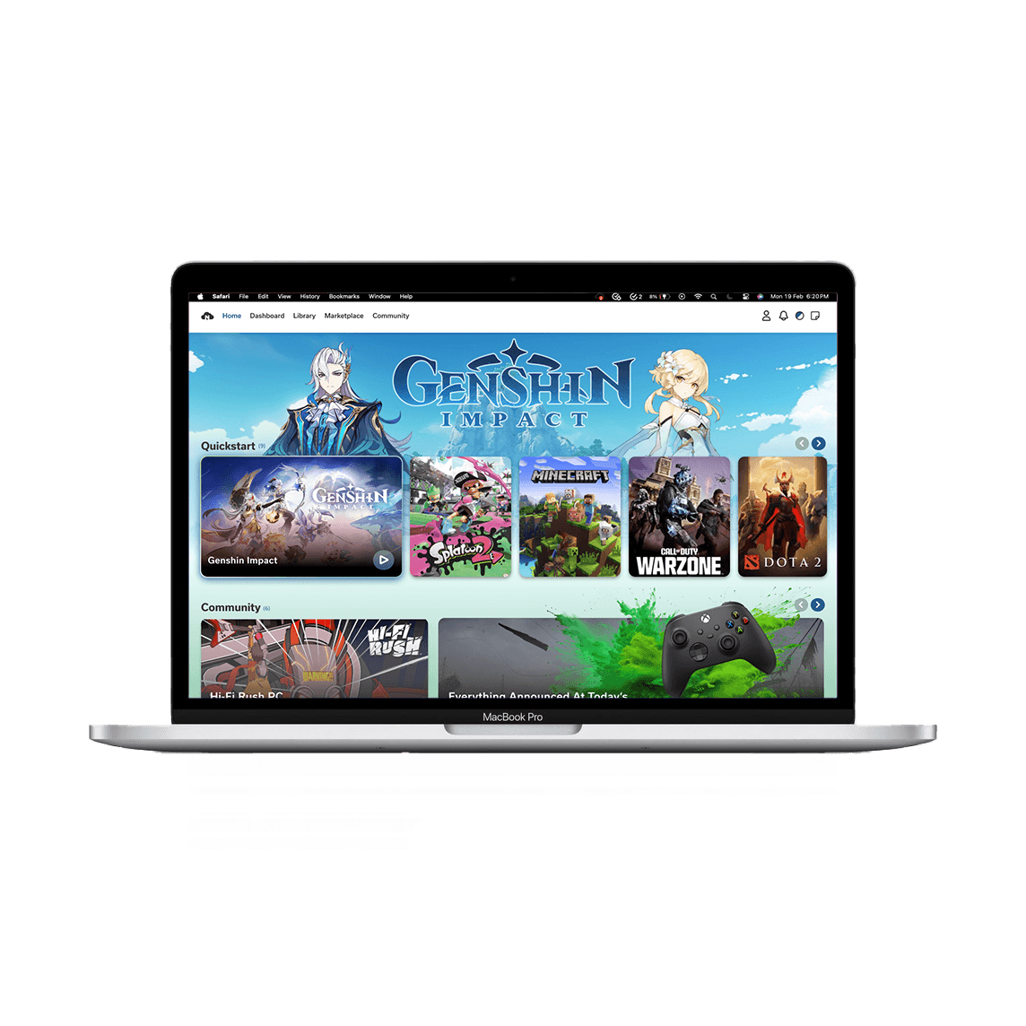
Upon launching Nimbus you are greeted with a banner of the last game you played, ready to be jumped back into. If you scroll on this page you can also find top community posts, FAQs, and links to other main pages in the launcher.
Library
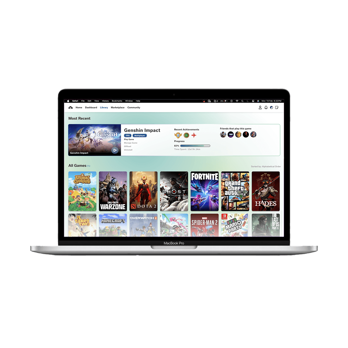
Another page accessible from the top bar is the Library, where you can access all your games at the click of a button. When you click on a game you are given information such as a game progress, recent achievements, and what friends also play it.
Marketplace

When you click on the Marketplace tab you are greeted into a collection of all new worlds to explore. Along the top is a gallery of banners that cycle through important information such as game updates or sales. As you scroll through the page you find different sections to explore such as games recommended for you, best selling games, new releases, and so much more!
Dashboards


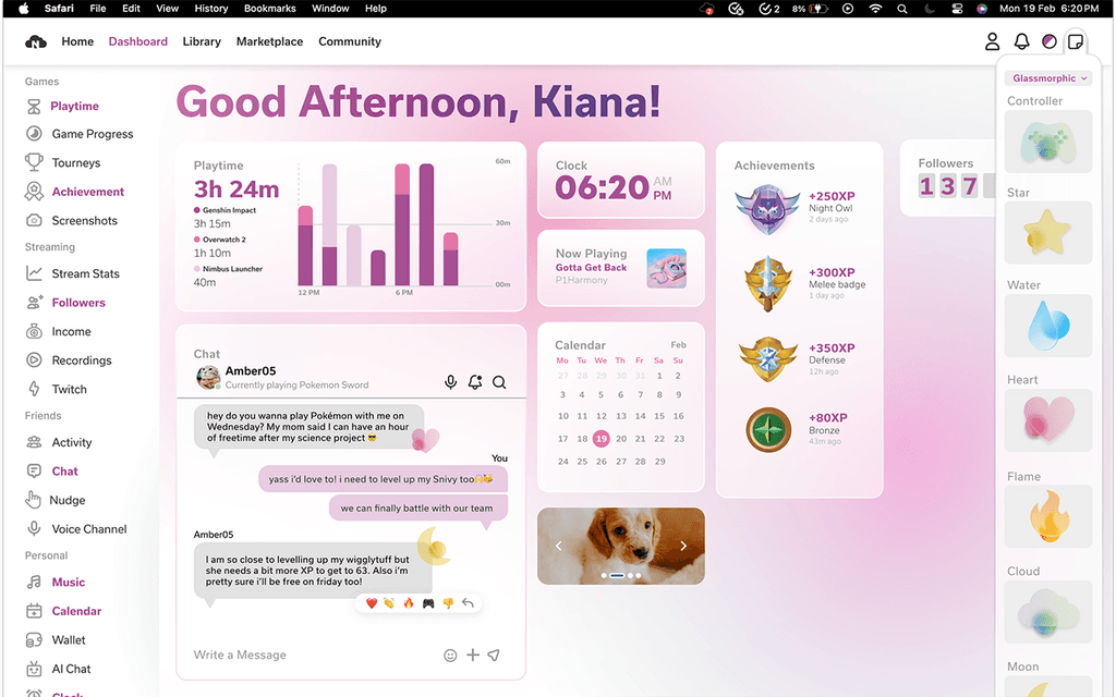

Above are 3 distinct dashboards that we created to correspond with our user personas. The custom dashboard is the users' own page to layout what features are important to them.
Interactions
Drag and Drop
A user can drag and drop features that they would like to have on their dashboard. Here you can see "Followers" being added.
Colorways
If the default blue-green theme is not you thing? No Problem! Easily change it at the click of a button, or even explore and create your own special theme.
Stickers
For even more customization options, users can drag stickers from the menu and paste them anywhere on their dashboard. Explore our multiple collections and find a cute pop of color to match your aesthetic!
Expansion
You can also choose how much information you would like to see by scaling and expanding the widget.
Assets
Branding
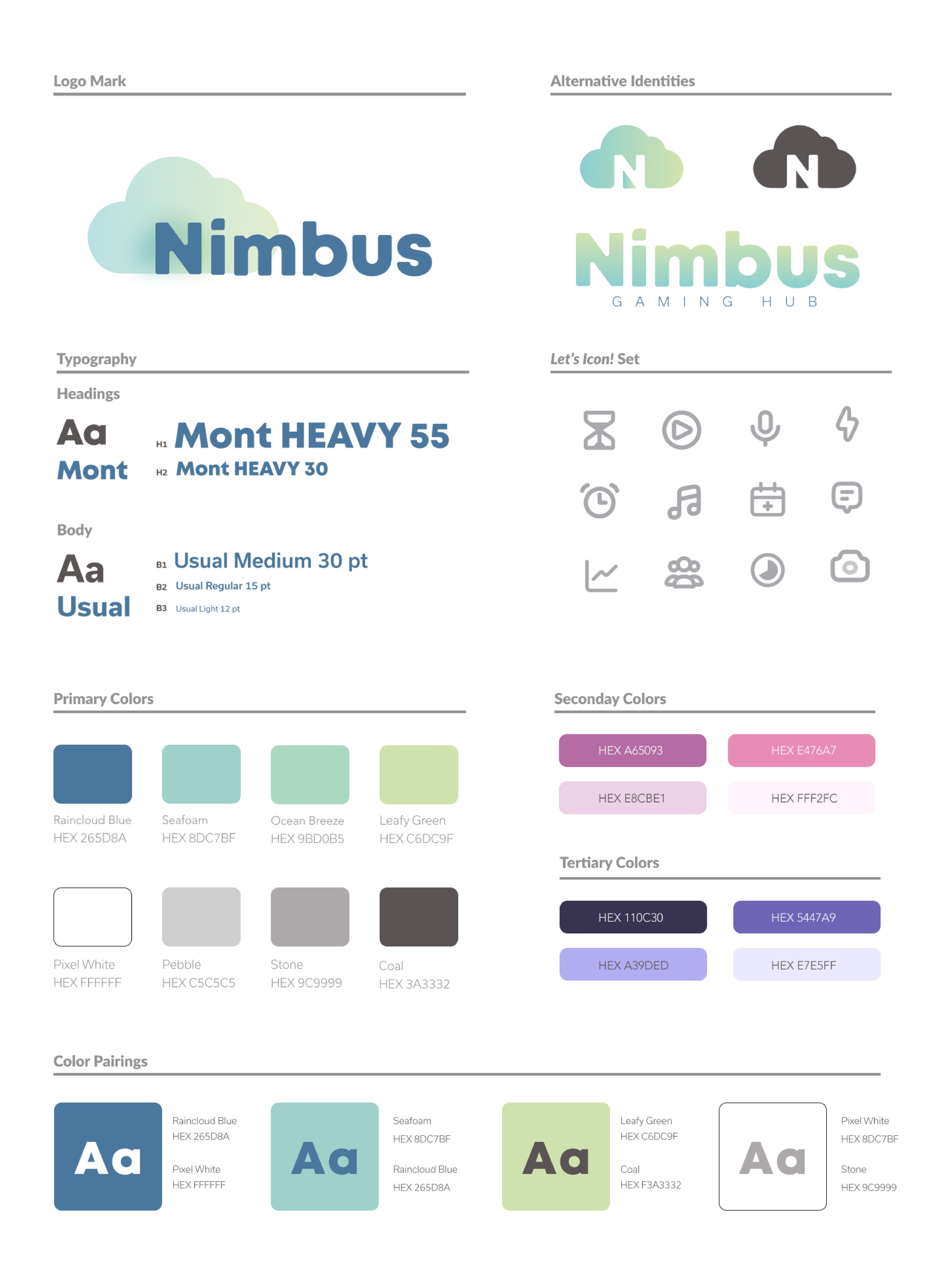
The branding guide displays what elements went into our design such as iconography, color, and fonts. We also wanted to expand it a little further and showcase color pairings and alternative identities.

To ensure our launcher was accessible to all we ran the color and text combinations through the WCAG Accessibility standards and all of the combinations passed.
Stickers

For our identity we wanted to focus on a transparent, gradient style that translates as futuristic and relaxing. These stickers are an example of intent and are seen in action in the Interactions section.
Badges

Another asset that we created for the dashboard were these bright, colorful badges. These are supposed model a more classic, harsh style of game design to stand out to users so they can see their accomplishments.
Widgets


Pictured above is an example of all of our widgets that we created for our dashboards. Throughout all of the widgets we applied the branding style guide seen at the top to ensure they align with the identity. You can see various ways we utilized color pairings, gradients, font hierarchy, margins, and more.
User Experience Research
Survey


We sent out a survey for others to fill out based on existing game launcher in order to inform the choices we made for our design. In this survey, respondents felt that current game launchers were geared more towards men with their dark colors and high contrast. They did not feel invited to the platform or the community so we first wanted to focus on understanding what would help consumers feel welcomed.
Competitive Analysis

From the survey, we looked at what game launchers respondents said they were familiar with. We then performed a competitive analysis between them to see where we would want to fit in this collection. This helped clarify what we wanted our game launcher to focus on: accessibility, welcoming, relaxing.
User Personas
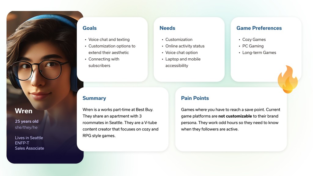

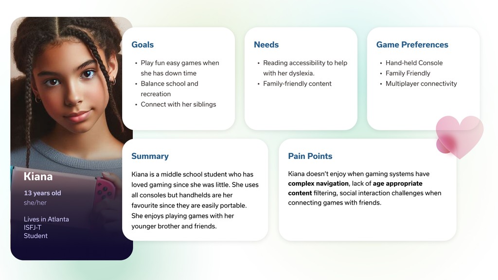
To better aid our target goals for our game launcher we created three user personas of different target demographics.
Wren is an only streamer and V-tube content creator who work part-time in retail. They need a dashboard to easily keep track and access various types of information such as their recordings, follower count, and game progress to name a few.
Richard is middle-age dad who works full time and plays games late at night to relax and catch up with his buds. His dashboard needs to have a dark color option so it is not harsh on his eyes and let him know what his friends' activity statuses are.
Kiana is a middle schooler who plays games after school as a way of communicating with her friends. She is really interested in self-expression and needs to have access to a kid friendly page.
User Journey Map

To understand why a user may choose to use our game launcher over a competitor's we tried to hypothesize why our persona "Wren" would decide to switch to Nimbus from Steam. In this graph you can understand Wren's internal thinking in each stage of adopting a new program and how they are feeling in each stage. It also helped us to ensure to have the function she would need, where others were lacking.
Takeaways
This was the largest scale project I have ever taken on in a group setting and I learned so many lessons during it, mainly about synergy, knowledge-sharing, and the importance of research.
Synergy:
I learned that synergy goes beyond just collaboration and happens when you are in the company of those who are just as passionate about the project and your creativity becomes amplified.
It is about being excited to work and having a vision you want to execute with those who also understand the end goal.
Knowledge-Sharing:
Our team was comprised of graphic designers with free different specialities: Branding, User Interface, and Print-Media.
These differences allowed us to come together and impart knowledge to each other to create a product that combines all of our strong suits.
We made an effort to try and learn from each other and work on everything together, instead of dividing the workflow and having it feel disconnected. It was because of this collaboration that the end result feels so united
Importance of Research:
This was my UI/UX Project that I approached as existing in the real-world so with that in mind there were extra steps in the beginning that we had to go through to keep the real-world audience in mind.
The research was fundamental in shaping our design to its very core to its font and color choices.
It has taught me how pivotal research is in the real-world and that informed decisions result in the best experience for everyone.
Thank you to Ani and Harrison for all of your teachings, guidance, and comradeship on this project. This was the best team I could have asked for and I so proud of all of our hard work!